Dream Pops Packaging Redesign Concept and Case Study
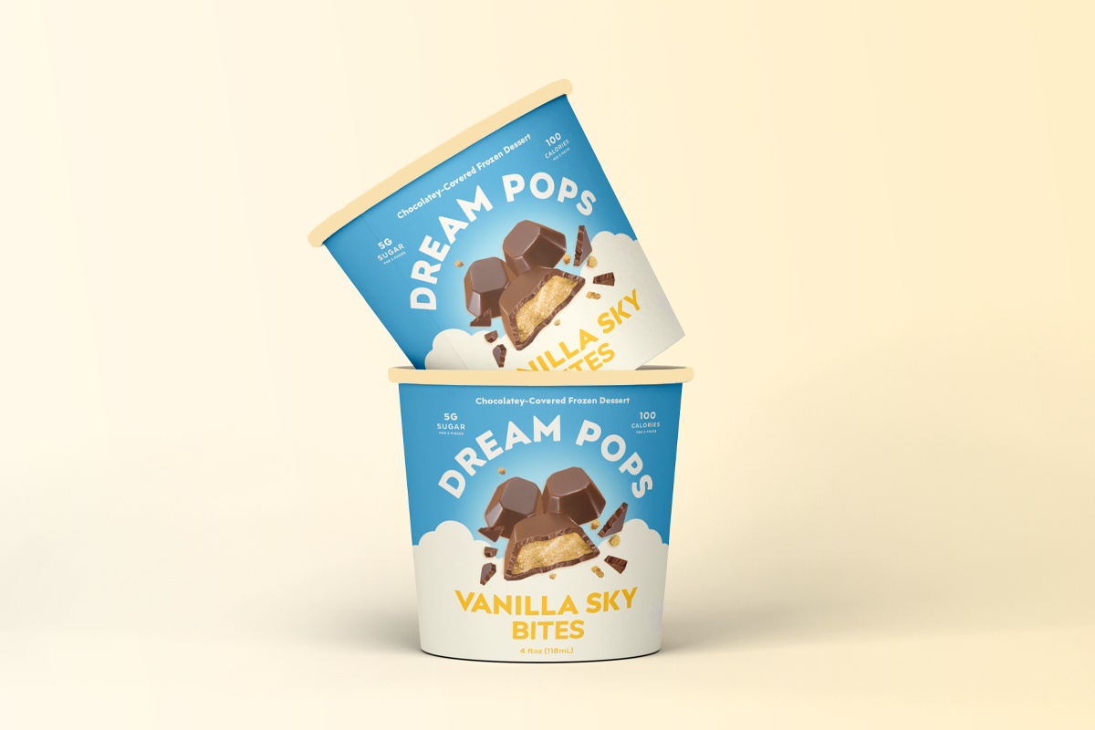
I was hired by the plant-based ice cream brand, Dream Pops, to explore some new packaging designs for their Sky Bites product line.
This concept explores what it looks like to simplify an existing design while relying on a lot of research to guide the way.

The Primary Question to Ask:
How can Dream Pops sit amongst the organic look and feel of a plant-based competitor, along with the explosions and high-energy design of the dairy and high-sugar products?

The Solve
The concept shown on the right is a softening of the brand identity while still bringing in high-energy elements of the delicious bites themselves. I subtracted the angular elements and replaced them with soft billowy illustrations and gradients. After all, the name has the word dream in the title. The new design is a bit more ethereal and uses a calm modern color palette that speaks to the vanilla flavor profile.

Sitting in the Sweet Spot
This redesign now sits in between both competitors in a sweet spot. It plays well in the plant-based space and has the appeal of the masses with its bold flavor explosion.

